문제 1.

From the line graph, we can see ..
Overall, nickel started with... Zinc started with the samllest change and ended with the highest, and ..
Prices for all three metals fell in June.
Copper after September and no percentage changes for any metal from July to September
Overall, percentage changes fell at the beginning of the year, remained static from July to September and rose after October to the end of the year.
In Jenuary the price of nicked was .., ending the year with ..
Copper began the eyar with an increas of .., the price was dropping..
It rose again, increasing by ..
Zinc saw its most dramatic increase in February, with..
The change was negative ..
(Vocabulary is adequate with some attempts to use less common items [fluctuated / dramatic increase] and attempts to use synonyms [ended with the lowest / dipped dropped])
문제 2.
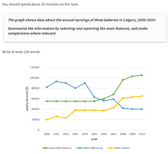
The graph shows information about .., over a ten-year period between 2000 and 2010.
Overall, what stands out from the graph is.., while the earnings of Mari Bakeshop saw ..
Another interesting point is that.., but in 2010, Amandine Bakery earned ..
Looking at the details, as regards Bolo Cakery, income started .., then here was a fluctuation over .., at which point it levelled off at..
Then the figure went up significantly, finishing at..
If we look at.., the trend was ..
Having remained stable at.. , income then rose sharply, reaching..
There was then a gradual rise to..
By contrast, the income of..
Taking fluctuated around .., the fugure then levelled off..
문제 3.
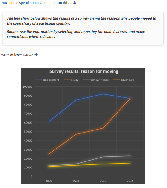
The line graph sets out the key motivations for people relocating to..
Moving for the purpose of study saw ..
It rose considerably in two periods - from.., and again from .., with a more gentle growth of..
Elsewhere, the figure of people relocating for work began at.., then peaked at..
Notably, this category was ..
Turning to 'adventure', this category rose .., from ..
Meanwhile, the number of people relocating for.. , followed by.., before eventually levelling off at..
문제 4.
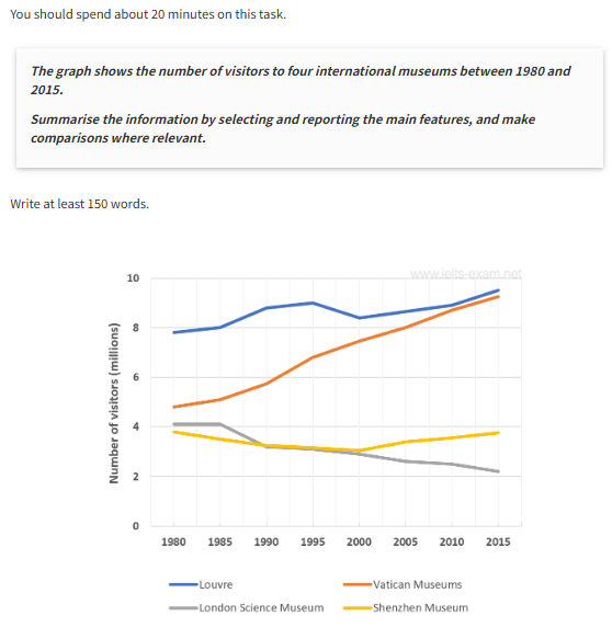
The line graph shows how many people visited four museums ..
All in all, the Louvre Museum was ..
The least popular were ..
The number of visitors to the London Science Museum decreased slowly from..
By contrast, the visitors to the Vatican Museum increased from just ..
In addition, the number of visitors to the Shenzhen Museum stayed about..
문제 5.
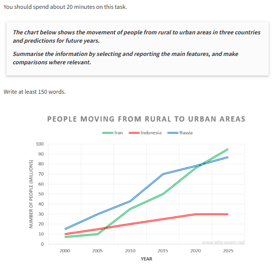
The line graph shows the figures in millions for the migration of people from the countryside to cities in three different countires over.., including future predictions. Overall, it is clear that..
All three countries began the period with..
Russia started with the most migrants (around 15 million) and ..., particularly between 2010 and 2015(around 42 to 70 million) and..
Similarly , Iran after a slow start between 2000 and 2005 sees ...
However, Indonesia bucks the trend somewhat.
Whilst consistently steady between 2000 and 2020, its growth is far less ..
Furthermore, post 2020, it is predicted to level off at around..
To sum up, while all three countries have seen growth up to 2015, only the fugures for ..
'IELTS' 카테고리의 다른 글
| IELTS Writing Task 1 (Academic - Bar chart) (2) | 2025.04.10 |
|---|---|
| IELTS Writing Task 1 (Academic - Table) (2) | 2025.04.09 |
| IELTS Writing Task 2(Academic) 주제 유형 (0) | 2025.04.07 |
| IELTS Writing Task 1(Academic) 문제 유형 (0) | 2025.04.07 |
| IELTS 소개 (0) | 2025.04.07 |